What is an Affinity Diagram?
Affinity Diagramming, also known as Affinity Mapping, is a clustering exercise that you and your team can use when dealing with a large amount of information that needs sorting, grouping, classifying, or culling. The result of this exercise is an Affinity Diagram.
In UX and product design, an Affinity Diagram is great for grouping and synthesizing data gathered during usability tests, research interviews, or idea brainstorming sessions, and is employed throughout several parts of the Design Thinking process.
Affinity Diagrams also help organize information into groups or themes based on their relationships, which will then help your team identify the problems and develop potential ideas for solutions. Since it’s a team activity, it often requires less time to unlock and build consensus around the insights too.
In short, Affinity Diagramming will help you name, rank and understand relationships between groups of information. It is a powerful exercise that can be used for various reasons at various times, and understanding what it is and how to perform it will allow you to decide when it is the right time to do it.

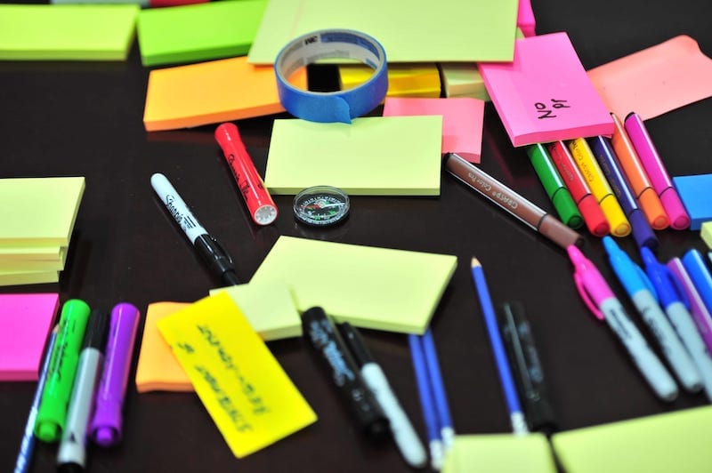
What do you need for an Affinity Diagram?
TIME
MATERIALS
How do you create an Affinity Diagram?
Step 1: Add each piece of information to a separate sticky note
Write down any insight, idea, or takeaway on a new sticky note. Depending on what you’re doing an Affinity Diagram for, these may come from usability tests, thoughts you have on listening to a research interview, or you may just be brainstorming problems for your users.
Step 2: Add all of those sticky notes to a wall
At this point, you can improvise a little. You can have your team read them and explain them while they add them to the wall, or have everyone just post them all at once. Do whatever you feel is the most beneficial for the purpose and the time, just make sure to add them all to the wall or board.
Step 3: Start grouping the sticky notes by theme
To group these, you can start with one sticky and place it in its own group. Next, take a second sticky from the wall. If it’s similar to that first one, add it to the existing group. If it’s different, create a new group for it.
Repeat the process by placing similar stickies together, and different ones in their own group. You can either have the moderator do this, or you can do it as a group to save some time. You should start seeing some clusters form, and as they form, feel free to rearrange the sticky notes if it makes sense to do so.
Step 4: Create names for the themes
Naming the clusters will allow you to create an information structure, discover your themes, and help you double-check if any clusters are too similar to each other. If that’s the case, you may want to merge those that are too similar, or rename them.
Step 5: Rank the themes by importance
Now that you have your themed clusters, you can rank them in order of importance. You can do this by taking votes or asking everyone to go around and mark their top choices next to the theme. You may want to review the goals of this exercise so you can be sure everyone is on the same page before you begin to rank them.
Step 6: Document the takeaways from this exercise
Now have a look at the clusters, the importance of each one, and the themes, then you will be able to pull some takeaways that will help you with your goals. These can be insights, user needs, pain points, or gaps. Document anything you pull from this exercise and share it with your team. You may also want to take some photos of the board so you can refer to it if anyone has any questions on how you came to your conclusions.
Tips for a great Affinity Diagram